The Best Travel Carbon Calculators for Finding Lower-Emission Travel [Part 3]
This is Part 3 in my series about understanding, calculating and reducing the carbon emissions of travel, and particularly of flights.
Need to catch up? Here are the rest of the posts in this series on travel and climate:
- Part 1 is about why I decided to take on this massive project.
- Part 2 is about calculating my carbon emissions from flights in 2022.
- Part 4 is about whether you should buy carbon offsets for travel – or invest your money in something else.)
- And Part 5 has my recommendations and quick take-aways.
- And here’s the very practical reason why I’m investing in carbon removal, along with reduction.
As I made painfully clear with a personal example in my last article, emissions from flying are the lion’s share of the total carbon footprint of travel. So, if you want to better understand your carbon footprint from travel, starting with flights is a good way to do it.
In this article, I’m laying out the differences between several carbon emissions calculators, so you can better understand how to calculate your carbon emissions from flights, and from travel in general.
The most important thing to remember as you read this is to not get lost in the weeds. Don’t let precision get in the way of understanding the bigger picture and taking action.
…However, this post is a “do as I say, not as I do” kind of thing, because it’s all about going off in the weeds. Before I calculated my carbon footprint from flights, I did a ton of research into the differences between several free travel carbon calculators, so I wanted to share what I’ve learned here.
These are the main points that make these carbon calculators so different (for flights):
- The numbers they use for the average grams of CO2 emitted per kilometer flown (or pounds of CO2 per mile flown, however you want to look at it). Some calculators just use one average emissions rate; others get more specific, considering the altitude, average load rate (how full the plane is), and the factors in the next point.
- The details they let you include – such as flying first class vs. economy, the exact route and layovers, and the exact aircraft model. (Some also differentiate between chartered and scheduled flights – and the two terms don’t always mean the same thing. They’ve really just forced me to make this article complicated, but I’ll do my best.)
- Whether they measure just plain CO2 emissions, or CO2 equivalent, which means including other greenhouse gasses and warming pollutants (like soot), contrails (which might cause about half of the climate impact of flights), and radiative forcing (which, to simplify, refers to the fact that emissions at higher altitudes are even worse). Some calculators don’t include any of those factors.
- The monetary value they put on each tonne of CO2 emitted (mostly relevant for the calculators that also sell offsets, or otherwise put a financial value on your emissions total).
…And these are the five travel carbon calculators I’m comparing:
- ICAO
- TravelAndClimate.org
- Sustainable Travel International
- Atmosfair
- Offset Alliance (being released soon)
Why those, and not others? All of them were recommended at the conferences and webinars I’ve attended this year about sustainable travel, and by the many climate experts I’ve talked with.
In the examples below, I’ve calculated the emissions for the same exact flight on each carbon calculator, and explained why the results are so different.
Warning: This is about to go into more detail than you might be interested to read. I completely get that, and I wrote the damn thing. If you just want to know which calculator is best for your needs, the highlights are in this comparison table:
ICAO gives kind of a baseline carbon calculation for flights – although a rather soft one (because it only considers CO2, but not other greenhouse gasses, radiative forcing, and emissions other factors).
- Button to convert between metric and standard units.
- Flights only.
- Ignores other GHGs besides CO2.
- Gives lower results that don't show true climate impact.
For many reasons, this calculator is the best for comparing different modes of transport – car vs. flight vs. train etc. – right next to each other, in one calculation.
- Differentiates between electric (EU) and diesel (US & elsewhere) trains.
- Calculate road trip emissions by origin and destination (instead of having to calculate distance separately).
- Includes ferries.
- Slightly clunky interface, but not hard once you know what you’re doing.
The most aggressive carbon calculator (meaning it gives the highest results). Usefully compares emissions between airlines – a piece of info travelers can actually use.
- Compare emissions among airlines!
- Very highly regarded by experts.
- Flights only.
A well-known organization that does good work, but their calculator isn't my favorite interface or features. Also sells carbon offsets.
- Great for calculating emissions from private jet or chartered flights – dozens of aircraft options.
- Flights, cars, cruises, yachts & other boats...
- ...But no ferries, trains or busses.
- Enter road trips or train trips only by distance or hours traveled – but not by origin and destination.
You can also click here to jump down and see which carbon calculators I actually use for different situations, after all this research.

ICAO: the UN’s Carbon Emissions Calculator for Flights
ICAO – the International Civil Aviation Organization – is part of the United Nations, but I like to think of them as iCow, a pet cow robot that fits in your pocket.
Okay, sorry. Anyway. ICAO makes a carbon emissions calculator for flights that’s a well-respected baseline in the industry. Since it’s from the UN, it’s based on data from 190+ reporting countries. (Data including aircraft types, fuel use, passenger to freight ratios, and load factors – or how full planes are.)
Still, I wouldn’t call this the most accurate or best carbon calculator for travelers – because it only includes CO2.
(That means it ignores other greenhouse gasses, or non-CO2 effects, including the altitude where emissions happen. Their reasoning is that science isn’t sure exactly how big those effects are. But science is sure that the answer isn’t zero.)
But ICAO does have one handy feature that all the others lack: An easy button to switch between results in metric and standard units. (Kilograms of CO2 per kilometer flown, vs pounds of CO2 per mile flown.)
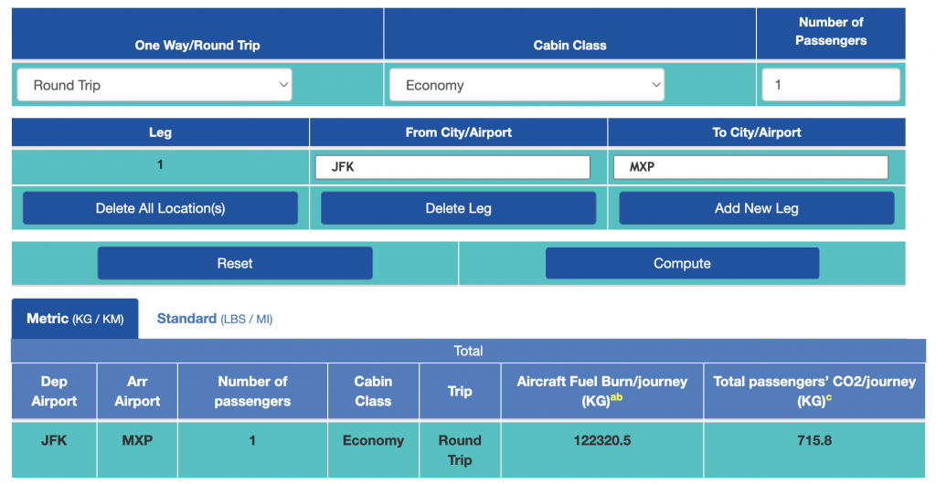
It’s fairly simple, although I wouldn’t exactly call the interface user-friendly. You select the cabin class of your flights (economy or “premium,” although it’s not clear exactly what they mean by that term), and add which airports you had layovers in, if any.
Tip to Reduce Flight Emissions: Planes burn the most fuel at take-off and landing, so taking direct flights whenever possible (and at least minimizing layovers when direct isn’t available) can greatly reduce your climate impact.
So for a flight that I generally take at least once a year, New York’s JFK airport to Milan’s Malpensa airport (MXP), the round-trip emissions, flying economy, come out to 716 kg of CO2.
(To get to JFK, I’ll have to add in a train ride from Boston to NYC, on Amtrak’s Acela fast train. That adds 34 kg of CO2 emissions – but if I had flown from Boston to JFK, it would have been 72 kg. For the train emissions, I used the next calculator on this list.)
TravelAndClimate.org: Great Emissions Calculator for Travel – Any Travel!
After ICAO, I moved on to the travel carbon calculator from TravelAndClimate.org, which is a project of several sustainable tourism organizations and universities in Sweden.
The calculator uses a uniform rate of 133 grams of CO2 per km of air travel, whether it’s a long- or short-haul flight.
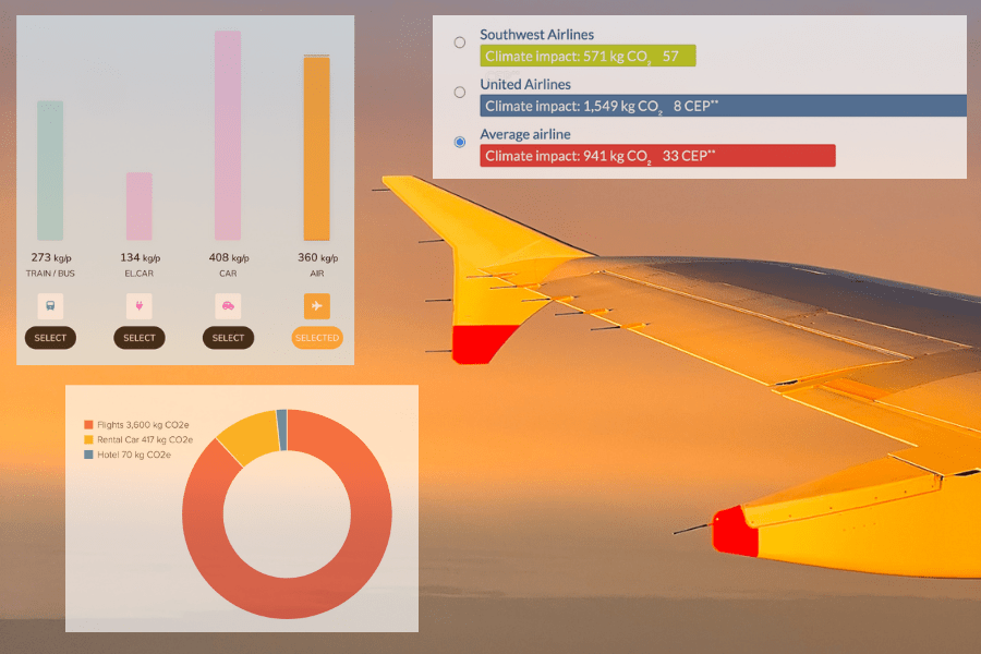
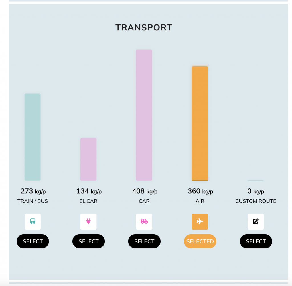
While it’s a little clunky to use at first, it gets the job done – and it doesn’t stop at flights. You can use the Travel And Climate calculator to compare train, bus, air, and car travel all in one place, and all at the same time.
That’s really unique and probably the most useful, actionable feature of any of these carbon calculators.
It also lets you include emissions from hotels and hostels. (The only one I’ve found with this feature, too.)
For flights, I really like that this carbon calculator includes the climate impact of fuel production and the non-CO2 effects of flights. Many of the others don’t, including ICAO. (That’s why ICAO’s results are so much lower.)
(There’s a good explanation of non-CO2 effects, and a comparison with ICAO, in TravelAndClimate.org’s methodology paper, along with the emissions differences between long- and short-haul flights. It’s really an interesting read! Go to pages 13 – 15, and skip below the giant, intimidating formula.)
It also includes emissions from getting to and from the airport. (A minor issue compared with the flights themselves, but I’m impressed by their thoroughness.)
Together, all those factors make a big difference (even though Travel And Climate doesn’t include radiative forcing). When I plugged my New York to Milan flight into this calculator, it came back with a much-worse-sounding 1,722 kg of CO2. (Much worse than the result from ICAO, I mean.)
Calculator Tip: For flights, you can specify economy, premium economy, or business/first class on the Travel And Climate calculator – you just have to click on the airplane icon after you click “calculate.” That’s a little illogical to me, but the option is there. (Same goes for the type of vehicle you’re driving for their road trip carbon calculator, or the type of train – electric or diesel – like in the gif below.)

You can also choose between scheduled or chartered flights – which they use to mean tour companies filling entire planes that they either own or lease. They use a slightly lower emission factor (118 g of CO2 per passenger km) for chartered, because those flights tend to have higher occupancy rates.
Sustainable Travel International: Carbon Calculator + Offsets (But not my favorite)
Next, I tested the travel carbon calculator from Sustainable Travel International. This one is fairly similar to the calculator from TravelandClimate.org in terms of results. But it also includes a carbon calculator for car trips, private planes, and some boats. (By “boats,” I mean cruises, liveaboards, and yachts – but not ferries. It also doesn’t calculate emissions for trains or busses).
For road trips, you select a type of vehicle, and then enter either the distance or hours driven. (There’s no option to just enter departure and arrival destinations, like you can with TravelAndClimate.org’s calculator for vehicle emissions – which I think is much easier.)
Another difference is that Sustainable Travel International uses more aggressive (bigger) assumptions for the carbon emissions of flights: From 140 to 550 grams of CO2 equivalent per passenger kilometer for scheduled (not private) flights.
(The difference is based on class and flight time. Longer flights go up to higher altitudes, and emissions at higher altitudes, in short, are worse. This is the RF factor I’ve mentioned above.)
Again, you can choose round-trip or one-way flights, and economy class or premium. (Although, just like the ICAO calculator, they don’t specify exactly what “premium” means – is it first class, or premium economy? It would definitely make a difference.)
Tip to Reduce Flight Emissions: Business or first class seats take up more space per person on the plane, and that means you get a bigger share of the emissions of the entire flight. In general, first class more than doubles the emissions of economy.
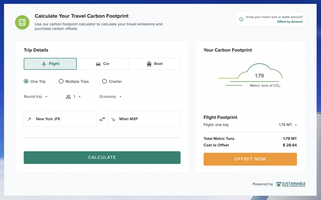
So I plugged in the same route – JFK to Milan Malpensa roundtrip – and the STI calculator gave me a total of 1.79 metric tons, AKA 1,790 kg of CO2.
That’s almost exactly the same result as from TravelAndClimate.org. (But I don’t love that Sustainable Travel International puts the result in terms of tonnes, instead of kilograms. Of course, the difference is just a matter of moving the decimal point. But I think using tonnes makes the emissions number feel smaller, and a little harder to make sense of.)
And you can choose between scheduled or chartered fights – but note that the Sustainable Travel International calculator uses “chartered” to mean “private plane.”
And in my opinion, that’s the best use for this carbon calculator – for private flights.
It’s the only one I’ve found that lets you calculate emissions based on the specific aircraft for those chartered flights – with dozens of planes to choose from. So if you find yourself zipping around on private jets, this is the carbon calculator for you.
Sustainable Travel International is also a broker selling verified emissions offsets, so if you choose, you can calculate your emissions and pay to offset them on the same site.
Their carbon offsets are pretty straightforward. You can’t choose the specific projects you support with your offset donation, but you donate to their portfolio of projects – supporting renewable energy development, and biodiversity and ecosystem protection.
For this, STI uses a value of $16 per metric tonne of CO2. (That’s the price you pay to buy carbon offsets from them. So my carbon emissions from flights in 2022 would cost $256 to offset from Sustainable Travel International. Just this JFK-MXP flight I’ve been testing would cost $29.)
Note: This is not the end of the conversation about carbon offsets! It’s hardly even the beginning. I’ll have another post dedicated to just that topic coming out soon.
Atmosfair – A very detailed carbon calculator for flights
Atmosfair is a German non-profit organization that’s one of the oldest and generally most respected carbon calculators in the industry. They’ve been around since 2003, and have created the most granular, detailed travel carbon calculator for flights that I’ve found. (And they only do flights – no trains, boats, or automobiles.)
I spoke with the co-founder of Tourism Declares A Climate Emergency, Jeremy Smith, at a conference recently, and he told me in no uncertain terms that he thinks Atmosfair is the best calculator out there for flights.
You can choose your flight class (economy, premium economy, business or first), and whether your flight is scheduled or chartered (which they use to mean fuller planes for package tours).
So far, that’s all just like TravelAndClimate.org.
But Atmosfair has the only calculator I’ve found that lets you see the emissions difference between specific aircraft (for regular, non-private flights), and based on which airports you had layovers in.
Tip to Reduce Flight Emissions: Newer airplanes, like the A320neo and the Boeing 787-9, are much more efficient. Routes with out-of-the-way layovers will increase your flight distance and emissions – even more than other, more convenient layovers.
All of these are optional, so if you don’t know which exact plane you flew on, Atmosfair will use an average emissions rate based on all the aircraft that fly your route.
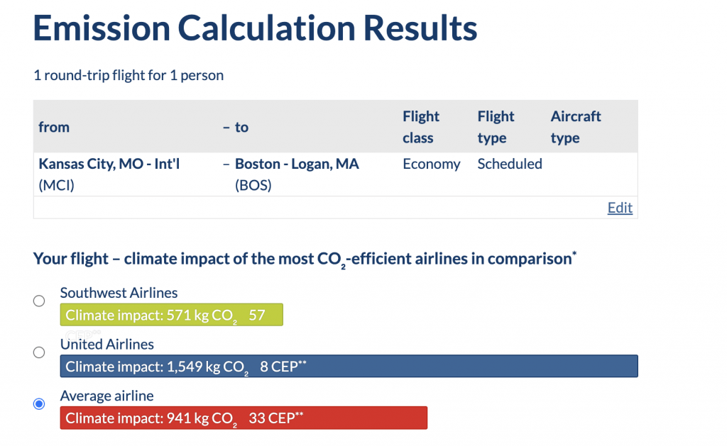
And my favorite thing about Atmosfair is that it gives results in terms of the most efficient airlines, versus the average airline.
Tip to Reduce Flight Emissions: In my calculations, I took note of whether I’d flown the least or most efficient airline, and what the difference would have been. What I found was that the most efficient airline was often, easily, 30% better than the average, and sometimes much more. The best example was a massive 63% emissions difference between United and Southwest Airlines – for the same exact route! That’s huge!
So again, I plugged in my JFK to Milan round-trip flight, economy class, and Atmosfair gave me an emission calculation of… 2,767 kg of CO2, wait what??
Why did Atmosfair give me an answer that was nearly double what the first two calculators said, and four times higher than ICAO’s, when I asked them all the same question?
I thought this was going to be a tough question, but it turns out the answer (or at least the beginning of one) is the very first point on Atmosfair’s FAQ page.
Their explanation is that Atmosfair includes other greenhouse gasses (like nitrogen oxide) and pollutants (like soot particles) that also have a climate warming effect – not just CO2. They then convert all of those to a CO2 “equivalent” figure.
But… they’re not the only ones who do this. Sustainable Travel International and TravelAndClimate.org also count non-CO2 factors. But Atmosfair also includes radiative forcing, as they explain in their methodology (pages 16-17):
“All carbon emissions produced during a flight at over 9 kilometers are multiplied by 3 to correctly render the flight’s climate impact in CO2.”
Translation: Atmosfair triples any CO2 emission that happen above 29,500 feet.
So, in reality, Atmosfair doesn’t necessarily give the most accurate picture of the total climate impact of a flight, but it certainly gives the most conservative one.
(In the sense that its calculations are a sort of worst-case scenario for the areas where scientists aren’t in agreement on just how bad the non-CO2 factors are.)
Like Sustainable Travel International, you can also buy carbon offsets directly through Atmosfair. Atmosfair calculates the donation (offset) amount using a value of €23 per tonne of CO2. (That’s about $24.50 USD, as of writing this in December, 2022.) So the price they assign to my New York to Milan flight is $68.
(One of the experts I talked to about this said maybe that’s why they use such aggressive calculations – to get more money into their offsetting program. I don’t necessarily agree, or necessarily think it’s a bad thing to encourage more donations. But we’ll go into that more in my next post – all about carbon offsetting.)
Atmosfair’s offsets support a range of projects, from providing efficient cookstoves, to renewable energy, to even “rebuilding tourism.”
Offset Alliance – Simple carbon calculator for flights
Offset Alliance is a Certified B-Corp based in San Diego, California, and its flight emissions calculator is a bit different – or at least it will be. Their main focus is helping tour operators and other local travel companies account for the climate impacts of their guests flying to them.
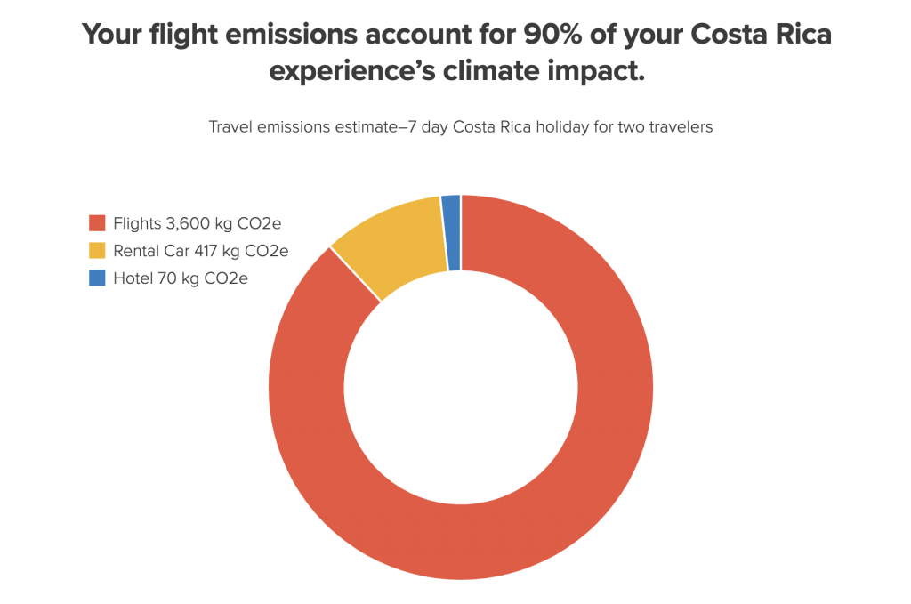
So, for example: If you fly to Costa Rica, and stay at an eco-lodge that offsets its emissions, those emissions that the lodge counts almost never include your flights to get to Costa Rica. (Flights are part of what you’ll see called “scope 3” emissions, if you read much about carbon accounting in travel, or any industry.)
Offset Alliance works with those local travel companies, and gives their customers an easy way to add up emissions, and buy verified offsets for them.
They do this by calculating average emissions from the most common routes flown between two places. First, they use Kayak and Skyscanner to find the most realistic and common routes between Point A and Point B.
Then they use emissions data from ICAO, but with an important caveat – they multiply ICAO’s numbers by 1.9 to account for radiative forcing (non-CO2 effects and other greenhouse gasses, and the fact that it all has an even worse warming effect when released at high altitudes).
That’s it. That’s their methodology, which, after trying to understand exactly how the other calculators come up with their numbers, you might find refreshingly simple.
They then sell verified offsets for those emissions at a value of $12 to $14 per metric tonne, which lets you buy into a portfolio of carbon offsetting projects.
It’s not available quite yet, but soon they’ll be launching a very simple travel carbon calculator using the same logic. The calculator won’t ask about layovers, or first class vs. economy, or whether the flight was private (it assumes it wasn’t).
I asked Offset Alliance’s co-founder, Henkel Smith, why they’re doing it this way. His reply:
“When it comes to leisure travelers that aren’t making climate action claims like a company would, we feel it’s best to focus on simplicity and convenience over detailed accuracy, in order to (hopefully) be maximizing engagement and action.”
Personally, I think it’s kind of a missed opportunity to not educate people on the differences in emissions that come with choices like first class vs. economy, and direct flights vs. layovers.
But it’s also a legitimate point. Getting more people engaged – even just getting them to start thinking about carbon emissions from travel – is a good thing.
So based on that, the emissions for my New York City to Milan flight should come out to 1,360 kg CO2 with the Offset Alliance calculator. (About half of what Atmosfair gave me, and about 20% less than Sustainable Travel International and TravelandClimate.org.)
At the rate they use for offsetting, the carbon “price” would be around $18 for that flight.
At the end of the day, does it matter which carbon calculator you use?
Yes, there are major differences in the results that come out of these five different carbon calculators, but it’s not because any of them are just guessing. It’s because they’re using different assumptions and formulas, where the science is still evolving every year.
(For example: For the non-CO2 effects of flight emissions, for a while the recommendation was to double the CO2 amount. Then a more recent paper recommended tripling it.)
These questions aren’t settled, and overall, the differences between these tools are small details in the big picture.
The only one I am really skeptical of is ICAO’s calculator, the first on this list.
Because it’s used by CORSIA, which is a new carbon offsetting plan for airlines, I have a hard time believing that they don’t just leave out the RF factor (radiative forcing) and other greenhouse gasses to make the industry’s numbers look a little less bad.
In fact, one expert I talked with put it more bluntly:
“I think it’s rubbish because they don’t include radiative forcing.”
That was Charlie Cotton, the founder of ecollective – a small consultancy that helps companies actually reduce the amount of carbon they emit throughout their entire business. (They’re a smart bunch of people. I’ve had several calls with them, and really respect their work.)
So using ICAO’s numbers as a starting point for further calculations (as Offset Alliance does) seems perfectly reasonable. But as a traveler, using ICAO and nothing else to understand your climate impact from flights would definitely give a low-ball estimate.
The whole point of doing this carbon calculation exercise, for travelers, is to understand the relative difference (and potential emissions savings) between different airlines, different routes, and between flying, driving, taking a train etc.
So the most important thing is to just compare like with like. Don’t use one calculator for one flight and a different one for another. So as long as you stick with one, you’ll have a perfectly good way to make those comparisons.
Here’s what I’ll be using:
If the focus of calculating travel emissions is to understand how to reduce them (as it should be, as opposed to just understanding how much to offset), then I think there are two clear winners here.
They’re the ones that give the most information that travelers can actually use to reduce emissions without traveling less:
For flight emissions, my preference is Atmosfair.
I appreciate the fact that it gives us the worst-case-scenario numbers. (After all, there’s not much point in this exercise if we’re going to try to sugar coat or minimize the results.)
But probably the best thing about Atmosfair is that it puts the emissions results in terms of the most efficient airlines. That’s such a useful piece of information that travelers can actually act on.
Plus, since Atmosfair provides the data that both Kayak and Momondo use, it’s an easy way to stay consistent and keep your numbers comparable. (If you use those for your flight searches, as I do.)
For everything other than flights, TravelandClimate.org is my top pick.
It’s extremely useful that this calculator lets you compare all the different ways you could travel in one interface. So you can easily see things like whether driving a long distance is more efficient than flying. (If you’re going solo, the answer is often no.) Again, that’s super actionable information that we can really use to make better travel choices.
You can also choose between different types of vehicles, and even diesel and electric trains. (Which is totally necessary for those of us still in the dark ages of train travel – the US of A). And it makes a big difference – athough even Amtrak still beats flying for climate impact.
For everything in life that’s not travel, here are three good calculators:
Charlie (from ecollective) recommended the WWF carbon footprint calculator because, “it speaks to you as a normal person.” (Especially if you live in the UK. If not, it’s still a good way to highlight which factors influence your footprint the most, you’ll just have to “translate” some terms from British, and the results won’t be as accurate.)
For US residents, the calculators from Conservation International and Cool Climate are two of the most complete I’ve found.
This could be a whole separate article – but don’t worry, I’m not going there right now.
Bottom line? Again – don’t get lost in the weeds when you start adding up your carbon footprint.
There’s definitely a risk (if you’re a bit of perfectionist, like me) that you’ll wonder, after hours of confusion, if it’s even worth bothering? The answer is yes.
What all scientists, and all of the teams behind all of the carbon calculators are sure of is that we need to understand our emissions in order to reduce them. All of the options listed above are a great start for that, so just pick one that works for you and use it.
I hope this comparison of travel carbon calculators has been helpful for you! If so, please consider sharing it with a friend or on social media, to help spread the knowledge.
If you have any questions, leave them below and I’ll get back to you!


Thanks a lot for this information! I’ve been looking for a good emissions calculator for Amtrak and until I found your blog I only knew of a very detailed analysis by the Environmental Protection Agency called “Savings in per-passenger CO2 emissions using rail rather than air travel in the northeastern US”. This report too, has been helpful as I’ve found out the exact amount of miles taken on Amtrak using reports from the Rail Passengers Association. Obviously, this is a mouthful, and I wasn’t satisfied to just see the findings of the report nor the claims of possible emissions reductions (compared to taking flights, obviously) by Amtrak. I felt the need to go further, and especially since just recently I took a 2 day trip on Amtrak that went outside the northeastern US.
Hi Neil,
Thanks for your comment! I’m happy I could help. 🙂
There are definitely some great tool out there. I do love Travel and Climate especially for trains in the US, since it’s the only calculator I’ve found that lets you choose the difference between diesel trains (like Amtrak, unfortunately) and electric trains.
How was your two-day Amtrak trip? I’ve done Montana to West Virginia a couple of times before, so I feel like I know what you went through! (Although I actually enjoyed it – lots of time to read and take in scenery!)
Thanks again! And if you haven’t already, you can get on my list to keep in touch!
-Ketti
Went from New York, NY to Austin, TX. The Lake Shore Limited train was delayed by almost 3 hours, and the break in between when that train arrived and the Texas Eagle departed was about 3 and a half hours, so I was worried that I would end up staying an entire day in Chicago! This didn’t happen, fortunately, and there were no additional hiccups besides the delay. One thing that started to get annoying were the freight trains passing by at high speeds (on the Lake Shore Limited, when our train was going at a high speed), as they blocked the view, and it was difficult to process the motion of the vast amount of freight cars (I tried my best to look away from the window). Also, the breaks in Dallas and Fort Worth, TX were quite long. But other than that, the train journey was not only quite fun; it became a trip down memory lane (I used to live near one of the stations served by the Texas Eagle, but now live on the east coast). The views of the snow and various places in the Midwest were beautiful! I was also able to chat with a few people whom I didn’t know. At the end of the trip my muscles were hurting and I was badly wanting a shower!
The Texas Eagle was the first and only Superliner train I’ve taken. I’m used to the trains in my state (not in the NE corridor, although I live near 2 lines that go directly to DC and NYC) that don’t have the big Superliner coach cars, but the views are still great regardless. The longest journey for my previous Amtrak train trip lasted 14 hours, at the most. That train was the first that I took ever, and I was still in high school then.
Sounds like an adventure!! And yes, freight trains are definitely the most annoying thing about Amtrak. Either they’re zooming by and blocking the view, or they’re causing a delay for hours. I wonder what it would take to actually get passenger specific tracks built in this country (and electrified, too!).
Thanks for the story!